
In my previous blog about the The role of colour in marketing – Part 1, we had a look at the effects that red, yellow, green and blue has on our emotions. Many marketing or consumer psychologists believe that colour makes all the difference to how your company is perceived.
When I worked at a previous magazine publishing company, we could never quite understand why on some months our sales for the magazine were great, and the next month it wasn’t. We had a close look at the sales statistics, and we found that every time we had a light green cover on the magazine – the sales went down. According to our publishing company at the time, the colour green on a magazine shelf never does well, as it does not stand out enough and fades into the background when next to other magazines.


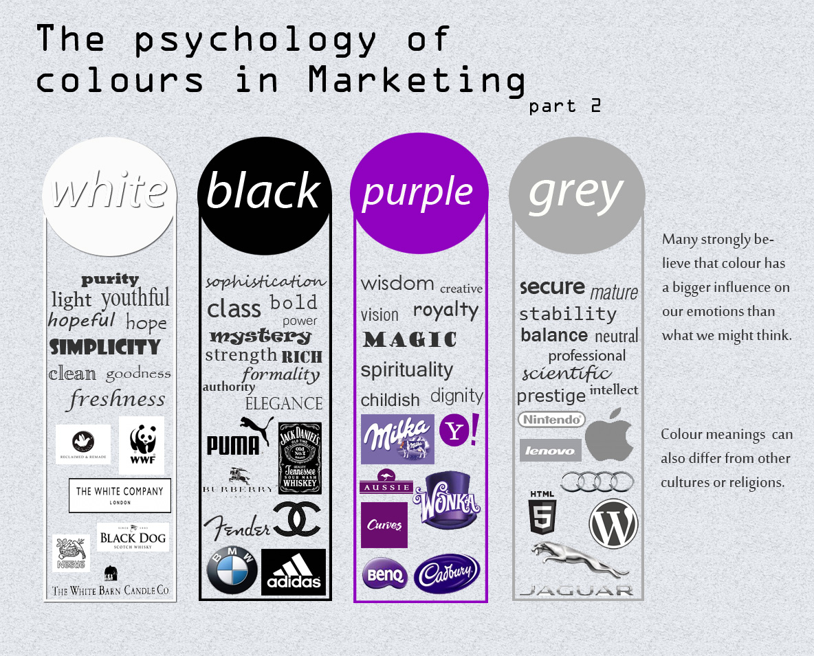
Let us take the colour black, often it is seen as an intimidating colour but in fact, it can have a classy, sophisticated and elegant effect if used correctly on company websites, billboards, print adverts etc. As explained in my previous blog, the colour meanings can also differ from one culture to another or according to different religions. For instance, where black means bad luck, unhappiness or evil in Thailand, it means health, prosperity and stability in far eastern cultures.
Doing some research on the subject of colour psychology, I have come to realise that even though there is no exact science behind it, many strongly believe that colour has a bigger influence on our emotions than what we might think.
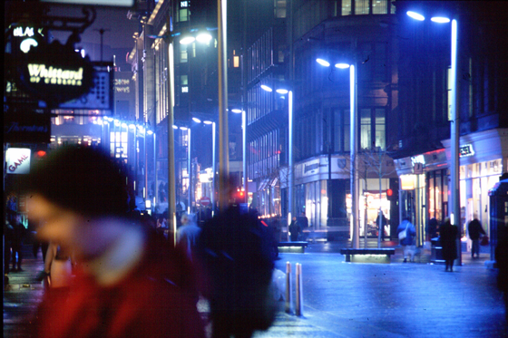
In Tokyo as well as Scotland, street lights in certain areas were changed to blue, and in both countries they have experienced a significant decrease in crime and suicides in those areas. Colour psychology suggests that blue has a calming and soothing effect, and by the looks of it, that might be true.

The colour grey is often described as boring; however I find that it is quite the opposite. Even the Guardian has described grey as the colour of the decade due the boom of grey in the fashion, interior and electronics industry. The colour gives off feelings of balance, responsibility, professionalism and maturity, thus always a good colour for a corporate company.
White is not often used as company logos or a main colour, as using white as the predominant colour can look quite boring. White space on a website is important though, as the eyes need somewhere to rest, but too much white can make your website or advert look like a quick and lazy job. White represents light, hope, goodness, freshness, purity, cleanliness. So white is always a good idea to use when you want to create a clean or fresh look.
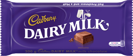
Purple is the colour of kings and royalty in many cultures and is often used in business to portray a high quality or a superior product, such as Cadbury's chocolate, Steers or Whiskas.


The colour of a $ 5,000 poker chip in America, which is the highest value made, is purple. Purple symbolises royalty, magic, mystery, spirituality, creativity and wisdom.
In 1900 B.C. it is said that purple dyes was used to dye the garments of emperors or privileged individuals and that it took about 12 000 shellfish to extract 1.5 grams of dye, which was barely enough to dye a single garment. So no wonder purple was seen to be only for the privileged or royal.
Ultimately, the colour you choose for your website, corporate logo or print advert can have an influence on your consumer’s behaviour or the feelings they experience from your brand. I for one believe that you can’t go wrong entirely when choosing company colours, as long as you don’t do anything outrageous or overdo it with too much colour, you should be just fine.

Read Part 1 of The role of colour in marketing
Lorraine Coetzee is a Digital Media Project Manager at Sound Idea Digital | Email: Lorraine@soundidea.co.za | Twitter: @SoundIdea
[Back]
blog comments powered by Disqus