
It is the number one web design trend of 2014, responding to the rising need of a website which caters to mobile devices before anything else.

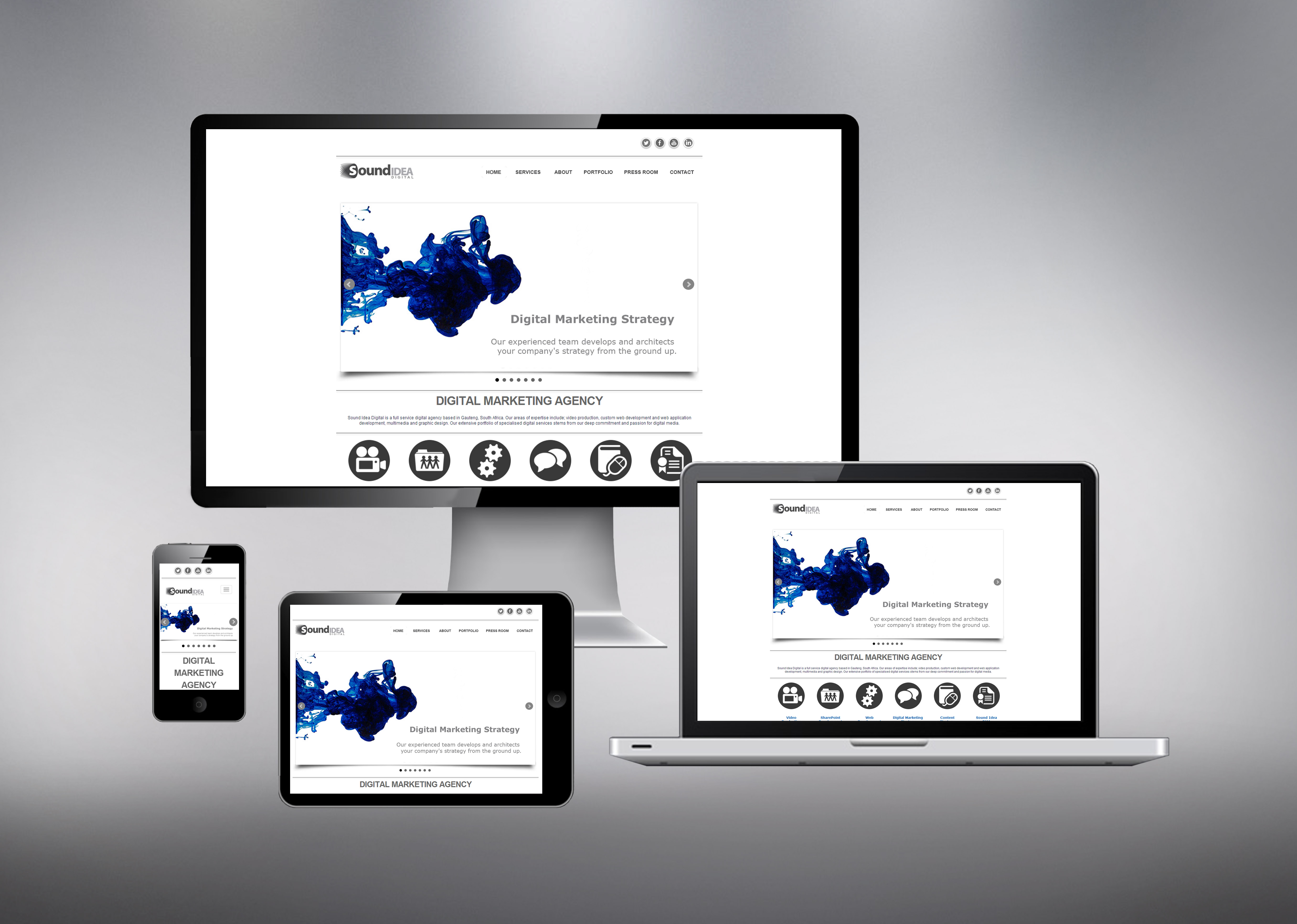
The purpose ofa responsive web design is to develop a website which provides an optimal viewing experience with little resizing, panning or scrolling to users operating on any kind of device. In recent years, savvy web designers have started to design a given website for mobile before they begin construction on the desktop site.
Mobi sites are dead
Just had to rip that band-aid off quickly. The first generation for mobile sites certainly did its job, but in the ever-changing world of technology, it is fast becoming a risky strategy to undertake. Here is why:
- Mobi redirects are not tending to SEO.
- Mobi sites can be very slow, which also kills the user’s eagerness to share on social media.
- They serve only mobiles, which excludes you from other device users such as the tablet, smart TV.
- The URL does not serve in emails. Email is the primary manner in which users share links and mobi links just do not work across all devices, so mobi users will not likely attempt to share your link.
- It’s mobi. To ensure that your website is easy to locate providing a user-friendly experience, all your resources ought to have one and the same URL.
Why adapt your website for mobile usage?
- 66% of smartphone / tablet users get incredibly frustrated with, among other things, loading times. Responsive design cuts loading time as it is ready to cater to any device. 16% of these give up on a website if the page takes too long to load.
- Mobile traffic makes up 16% of overall web traffic and is predicted to dominate desktop traffic by the end of 2014.
- 85% of users expect a mobile website to be of the same quality as a desktop website.
- 48% of users feel that a company does not care for business if they are not mobile-optimised.
- 90% of users go online with multiple devices.
- 67% of users are likely to make an online purchase using their smartphone.
- 48% of mobile and tablet users will complain if a website is not optimised for their device.
The Design of it all
To create a responsive design site, you need to be aware of what your users are looking for when it comes to the visual aspects. A website which is designed in a simple manner and does not suffer from information overload may be easier to navigate. While much web design is based on pixels, approach your responsive web design from vector-based platform. This allows you to create the same look for all versions of your website, without losing any picture quality, as the vector allows for much resizing.
Keep in mind that you will have some differences in your device-optimisation set-up for the website. Desktop sites love rich, interactive content as users tend to spend longer on-end times with their PC. Users spend more, but smaller chunks of time on mobile sites, so image-based news or videos are good to embed in the website. Also include the social sharing function on the mobile version of your website as mobile users are also very interactive users. It is a fact that mobile users prefer video content, so a good idea would be to include a short video on each of your landing pages – giving users the option to choose whether they want to read longer pieces of text, or simply watch a video summary of the text.
Now, before you start designing, ask the following questions to ensure that you are on the right track:
- Does the content cater to every persona in our established / potential client-base?
- Are we providing information in various content types? Such as infographics, video, articles, blogs, etc.
- Do our ideas suit multiple devices?
- Do we have a long tail plan?
- Do we have evergreen content and do we know how often our non-evergreen content needs to be updated?
Mobile is fast becoming a powerful tool for digital marketing and not adhering to that change is a dangerous option to entertain. A website which does not cater to mobile, other devices excluded, can lose up to 40% of its views.
Mari Roelofse is a Digital Journalist & Content Editor for Sound Idea Digital | mari@soundidea.co.za | Sound Idea Digital | www.soundidea.co.za
[Back]
blog comments powered by Disqus